Creating a distinctive, empowering, brand identity to connect a woman-first training company with its audience in a competitive market.
Creating a distinctive, empowering, brand identity to connect a woman-first training company with its audience in a competitive market.
PROJECT
BETTR
Year
2023
Category
BRANDING, VISUAL DESIGN
Tools
FIGMA, ILLUSTRATOR


OVERVIEW
This case study explores a branding project I undertook to establish a distinctive and empowering identity for a woman-first, small group personal training company - aimed at resonating with its target audience and standing out in a competitive market.
This case study explores a branding project I undertook to establish a distinctive and empowering identity for a woman-first, small group personal training company - aimed at resonating with its target audience and standing out in a competitive market.
This case study explores a branding project I undertook to establish a distinctive and empowering identity for a woman-first, small group personal training company - aimed at resonating with its target audience and standing out in a competitive market.


DESIGN
The client wanted a clean and clear logo that depicts health and fitness. However, despite being focussed on a woman-first enterprise at the moment, the founder didn’t want the branding to be gender specific so as to allow them to potentially branch out in the future. A simple but creative solution was created by using the primary letter ‘B’ within the shapes of a kettle bell.
The use of bold, people-first imagery, as well as a grunge texture and a black and white colour scheme, helped to create a raw and powerful aesthetic that embodied strength.


FEEDBACK
“Angus understood my vision perfectly and has brought my brand to life through immense attention to detail. The branding has helped my company secure new clients by making it feel professional and established.”
– Dylan, Bettr Founder
“Angus understood my vision perfectly and has brought my brand to life through immense attention to detail. The branding has helped my company secure new clients by making it feel professional and established.”
– Dylan, Bettr Founder


More Works More Works
More Works More Works
Motion
Motion
Prototyping
Prototyping
StreamLayer

Motion
Motion
Prototyping
Prototyping
StreamLayer

Motion
Motion
Prototyping
Prototyping
StreamLayer

Motion
Motion
Prototyping
Prototyping
StreamLayer

Motion
Motion
Prototyping
Prototyping
StreamLayer

UI Design
UI Design
UX Design
UX Design
Standard Life
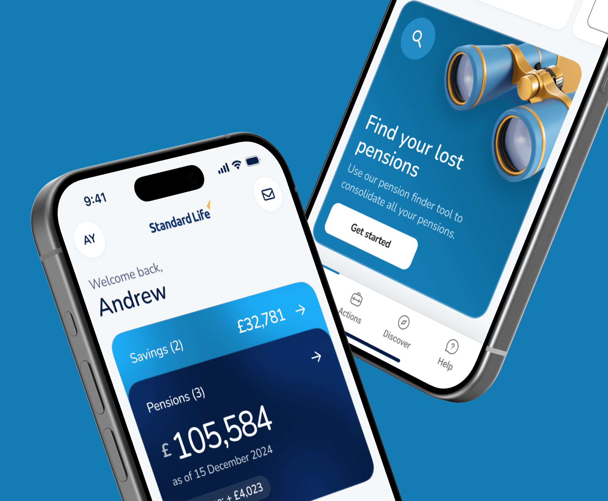
UI Design
UI Design
UX Design
UX Design
Standard Life

UI Design
UI Design
UX Design
UX Design
Standard Life

UI Design
UI Design
UX Design
UX Design
Standard Life

UI Design
UI Design
UX Design
UX Design
Standard Life

STEVENSON
STEVENSON
STEVENSON
STEVENSON
STEVENSON
©2024
GO BACK TO TOP
©2024
GO BACK TO TOP
©2024
GO BACK TO TOP
©2024
GO BACK TO TOP
©2024
GO BACK TO TOP