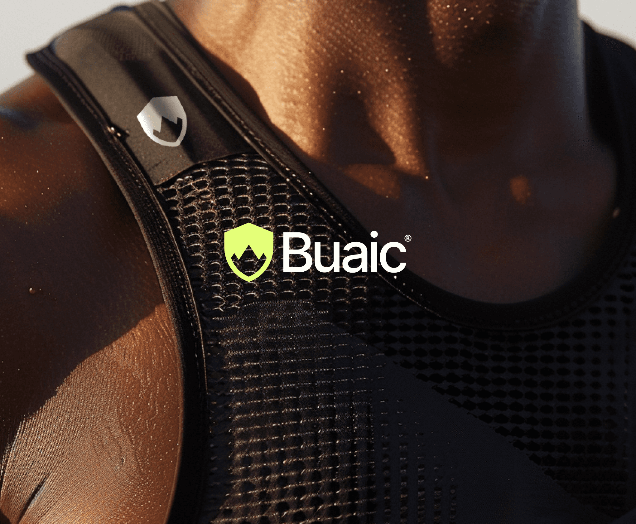
Designing aa striking and creative piece of visual identity for a startup sports injury prevention brand.
Designing aa striking and creative piece of visual identity for a startup sports injury prevention brand.
PROJECT
BUAIC
Year
2024
Category
BRANDING
Tools
FIGMA, ILLUSTRATOR


OVERVIEW
Earlier this year, I had the opportunity to develop the visual identity for Buaic, a Scottish sports injury protection startup. The company specialises in helping athletes recover from severe shoulder dislocations, enabling them to return to contact sports with the support of their robust shoulder braces.
Earlier this year, I had the opportunity to develop the visual identity for Buaic, a Scottish sports injury protection startup. The company specialises in helping athletes recover from severe shoulder dislocations, enabling them to return to contact sports with the support of their robust shoulder braces.
Earlier this year, I had the opportunity to develop the visual identity for Buaic, a Scottish sports injury protection startup. The company specialises in helping athletes recover from severe shoulder dislocations, enabling them to return to contact sports with the support of their robust shoulder braces.


BRANDING
During the branding process I focused on creating a visual identity that embodies both strength and recovery. The colour palette uses green as a key element to symbolise health, growth, and progress.
The logo mark is a clever combination of a shield, representing injury protection, and a mountain cutout, inspired by the meaning of ‘Buaic,’ which translates to ‘peak’ in Scottish Gaelic.
The result is a clean, professional logo that reflects the company’s mission to help athletes reach their peak performance while staying protected.


FEEDBACK
“Angus was brilliant to work with throughout the entire branding process. It felt seamless and we were very happy with the results he produced.”
– Seb, Buaic Founder
“Angus was brilliant to work with throughout the entire branding process. It felt seamless and we were very happy with the results he produced.”
– Seb, Buaic Founder


More Works More Works
More Works More Works
Motion
Motion
Prototyping
Prototyping
StreamLayer

Motion
Motion
Prototyping
Prototyping
StreamLayer

Motion
Motion
Prototyping
Prototyping
StreamLayer

Motion
Motion
Prototyping
Prototyping
StreamLayer

Motion
Motion
Prototyping
Prototyping
StreamLayer

Branding
Branding
The Racing Line

Branding
Branding
The Racing Line

Branding
Branding
The Racing Line

Branding
Branding
The Racing Line

Branding
Branding
The Racing Line

STEVENSON
STEVENSON
STEVENSON
STEVENSON
STEVENSON
©2024
GO BACK TO TOP
©2024
GO BACK TO TOP
©2024
GO BACK TO TOP
©2024
GO BACK TO TOP
©2024
GO BACK TO TOP