Transforming a historically traditional company to have a fresh, modern look to attract new customers for their latest health and wellbeing application.
Transforming a historically traditional company to have a fresh, modern look to attract new customers for their latest health and wellbeing application.
PROJECT
WPA, DIGITAL HEALTH
Year
2022
Category
BRANDING, MOTION
Tools
ILLUSTRATOR, AFTER EFFECTS


OVERVIEW
A couple of years ago I was brought in to produce a brand identity for a new practical health and wellbeing app that was being brought out by WPA.
A couple of years ago I was brought in to produce a brand identity for a new practical health and wellbeing app that was being brought out by WPA.
A couple of years ago I was brought in to produce a brand identity for a new practical health and wellbeing app that was being brought out by WPA.


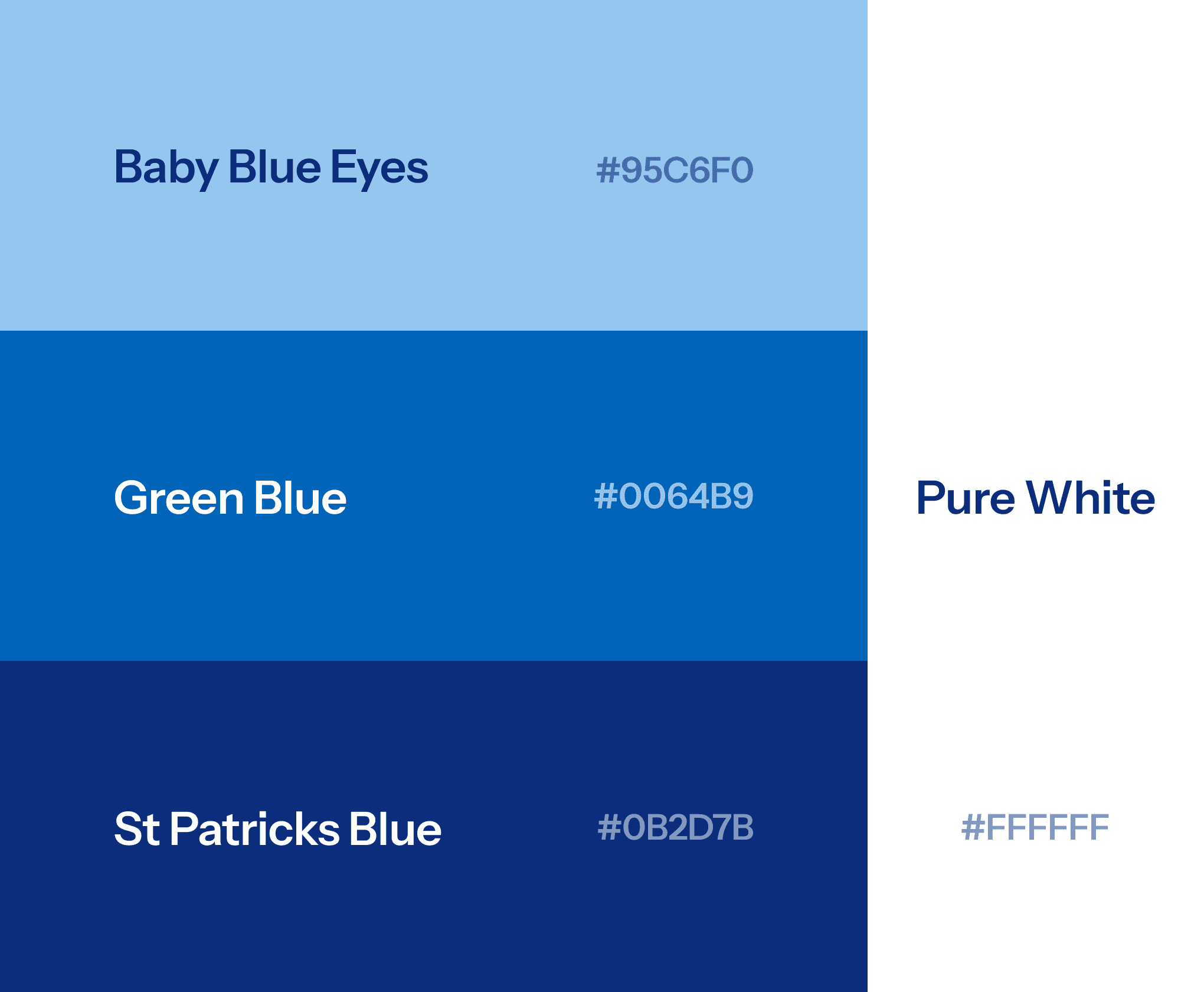

BRANDING
The project began with a series of workshops to uncover the client's goals, pain points, and desired brand positioning. Key insights from these sessions highlighted a focus on 'happy health' and 'people,' which became the foundation of our branding strategy.
Additionally, the brand needed to be adaptable for a white-label product, allowing companies to replace 'WPA' with their own logo.
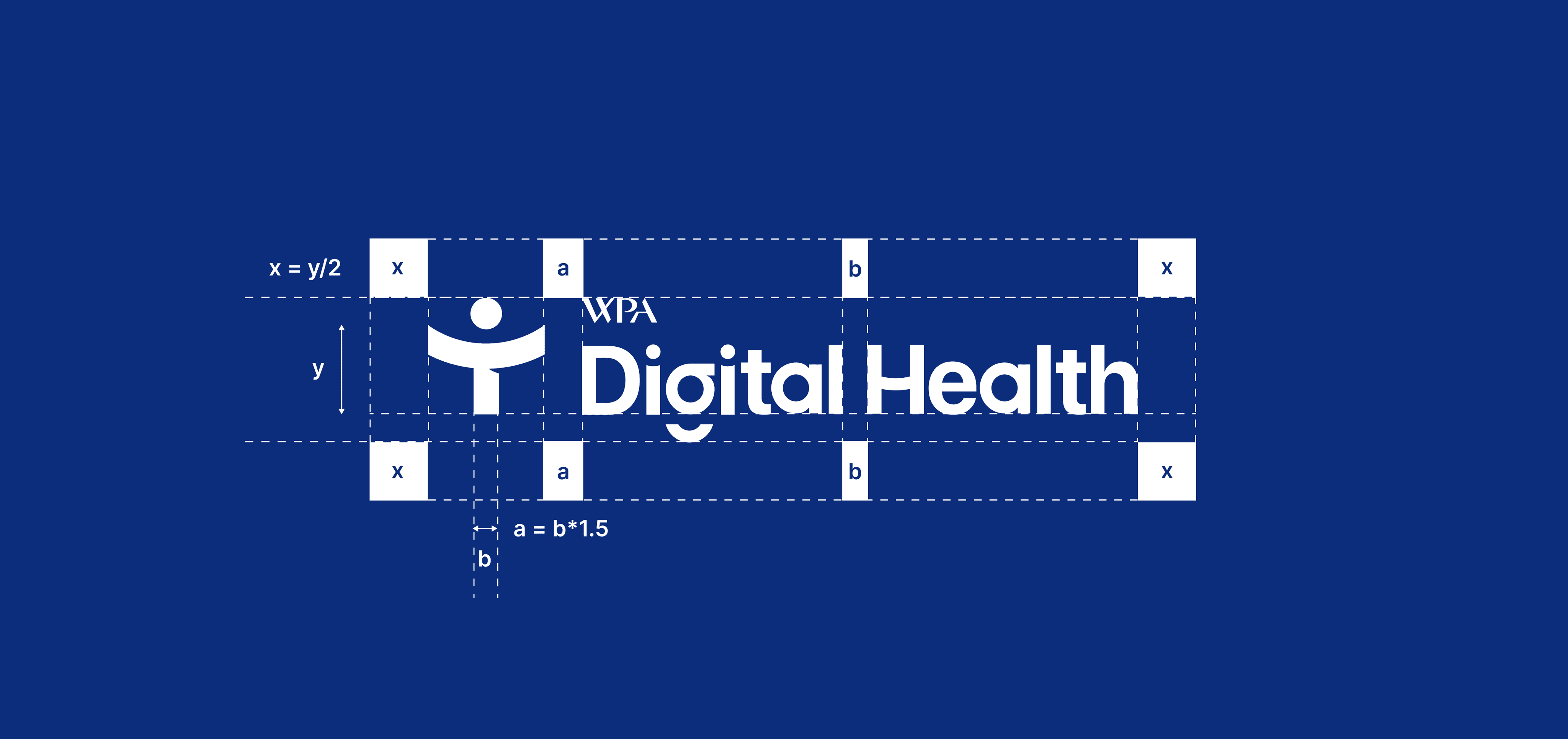
The logo mark creatively combines a plus symbol for health, with an arced horizontal bar to evoke happiness, and a person figure. This theme of happiness was carried into the logotype by customising the 'G' and 'H' to feature an arced smile, reinforcing the brand's joyful identity.
MOTION
I produced several pieces of motion for the brand to visually communicate the story behind its design and to be used in marketing materials. These videos were key when presenting the design to stakeholders, effectively conveying the thought process and craftsmanship, which played a key role in securing their buy-in and enthusiasm for the brand.
I produced several pieces of motion for the brand to visually communicate the story behind its design and to be used in marketing materials. These videos were key when presenting the design to stakeholders, effectively conveying the thought process and craftsmanship, which played a key role in securing their buy-in and enthusiasm for the brand.


More Works More Works
More Works More Works
Branding
Branding
Buaic

Branding
Branding
Buaic

Branding
Branding
Buaic

Branding
Branding
Buaic

Branding
Branding
Buaic

UI Design
UI Design
UX Design
UX Design
Standard Life
UI Design
UI Design
UX Design
UX Design
Standard Life

UI Design
UI Design
UX Design
UX Design
Standard Life

UI Design
UI Design
UX Design
UX Design
Standard Life

UI Design
UI Design
UX Design
UX Design
Standard Life

STEVENSON
STEVENSON
STEVENSON
STEVENSON
STEVENSON
©2024
GO BACK TO TOP
©2024
GO BACK TO TOP
©2024
GO BACK TO TOP
©2024
GO BACK TO TOP
©2024
GO BACK TO TOP