Designing striking visuals for mobile and desktop screens to secure a full digital overhaul project for an outdated asset management firm.
Designing striking visuals for mobile and desktop screens to secure a full digital overhaul project for an outdated asset management firm.
PROJECT
METEOR
Year
2024
Category
UI DESIGN
Tools
FIGMA

OVERVIEW
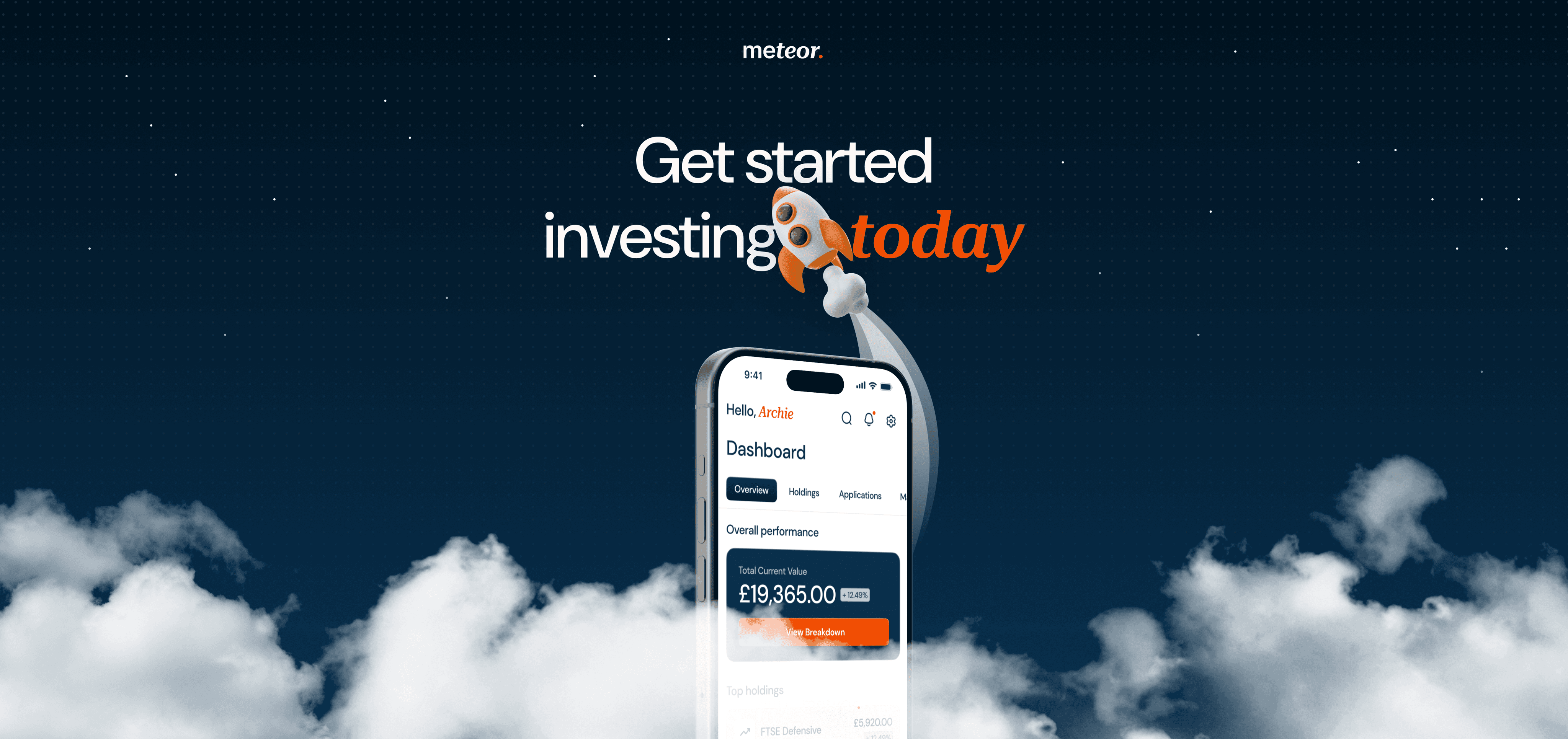
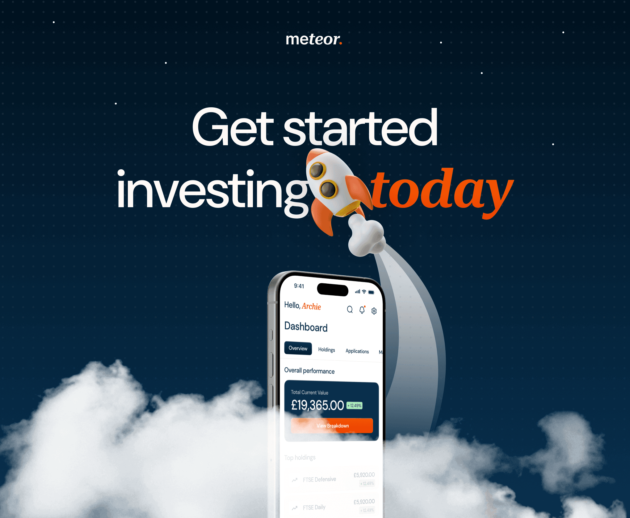
During my time at Waracle I worked on a presales concept project for an asset management company called Meteor. I was brought in to give a visual overhaul to their existing platform as part of Waracle’s bid to win the project.
During my time at Waracle I worked on a presales concept project for an asset management company called Meteor. I was brought in to give a visual overhaul to their existing platform as part of Waracle’s bid to win the project.
During my time at Waracle I worked on a presales concept project for an asset management company called Meteor. I was brought in to give a visual overhaul to their existing platform as part of Waracle’s bid to win the project.


DESIGN
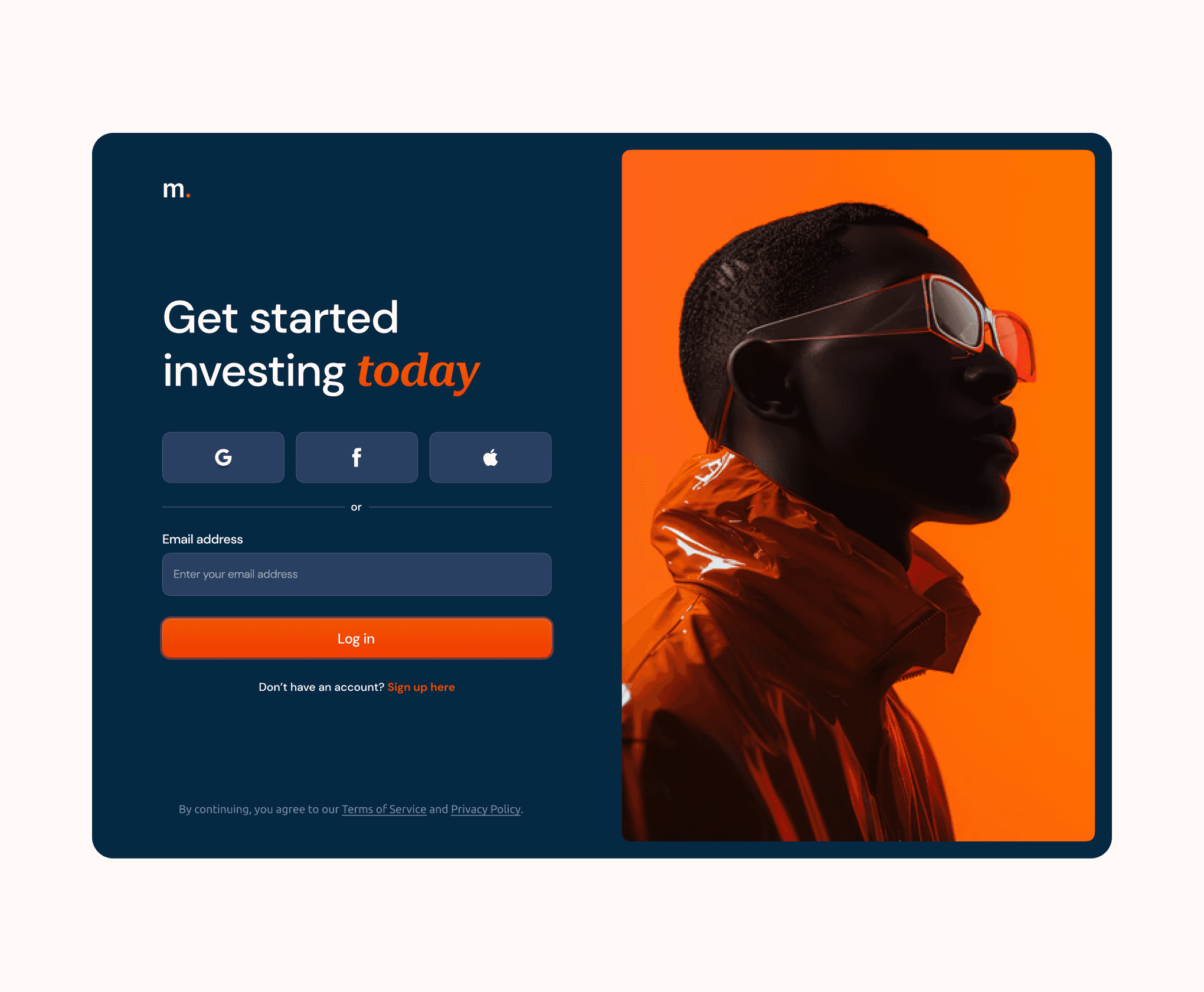
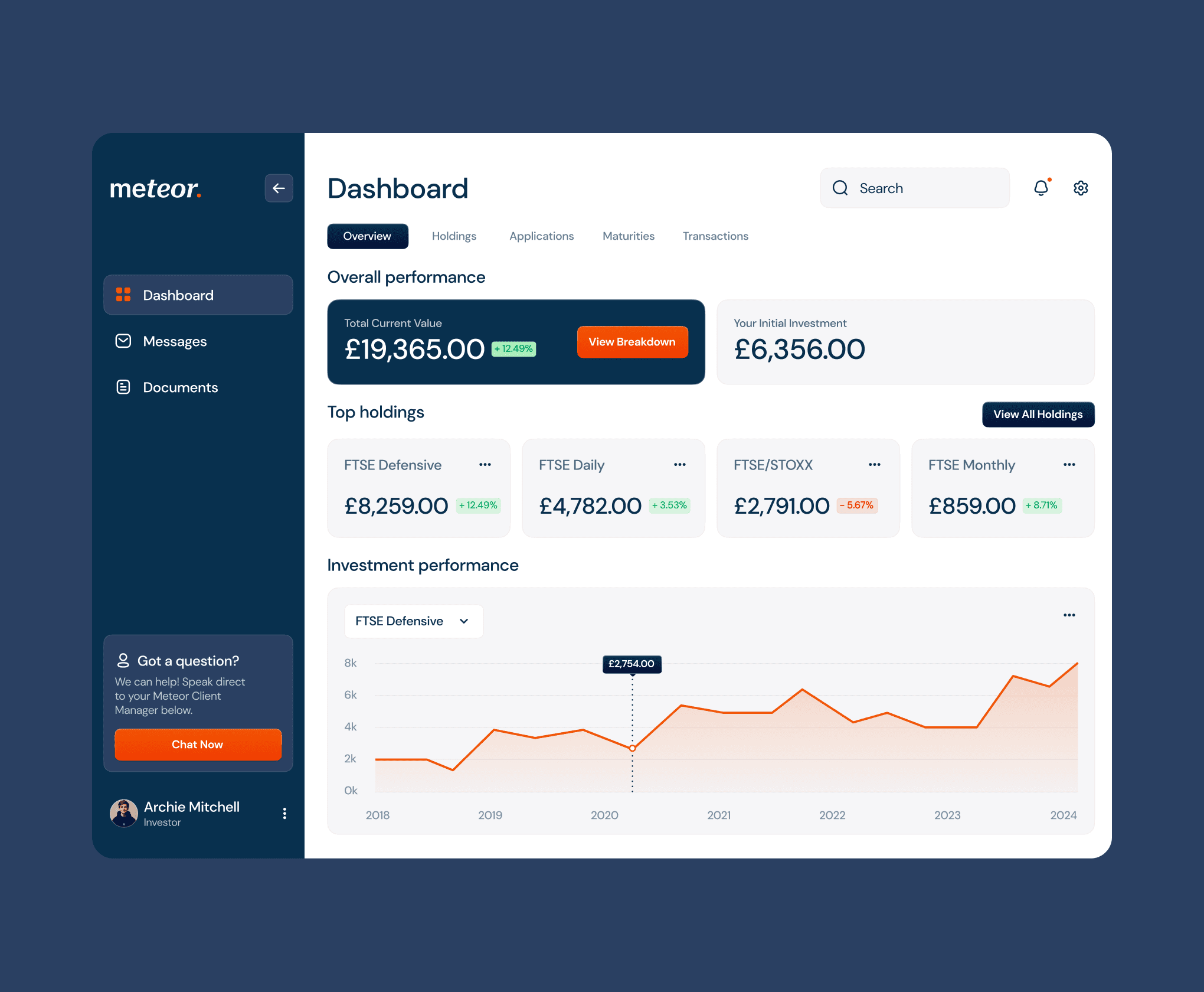
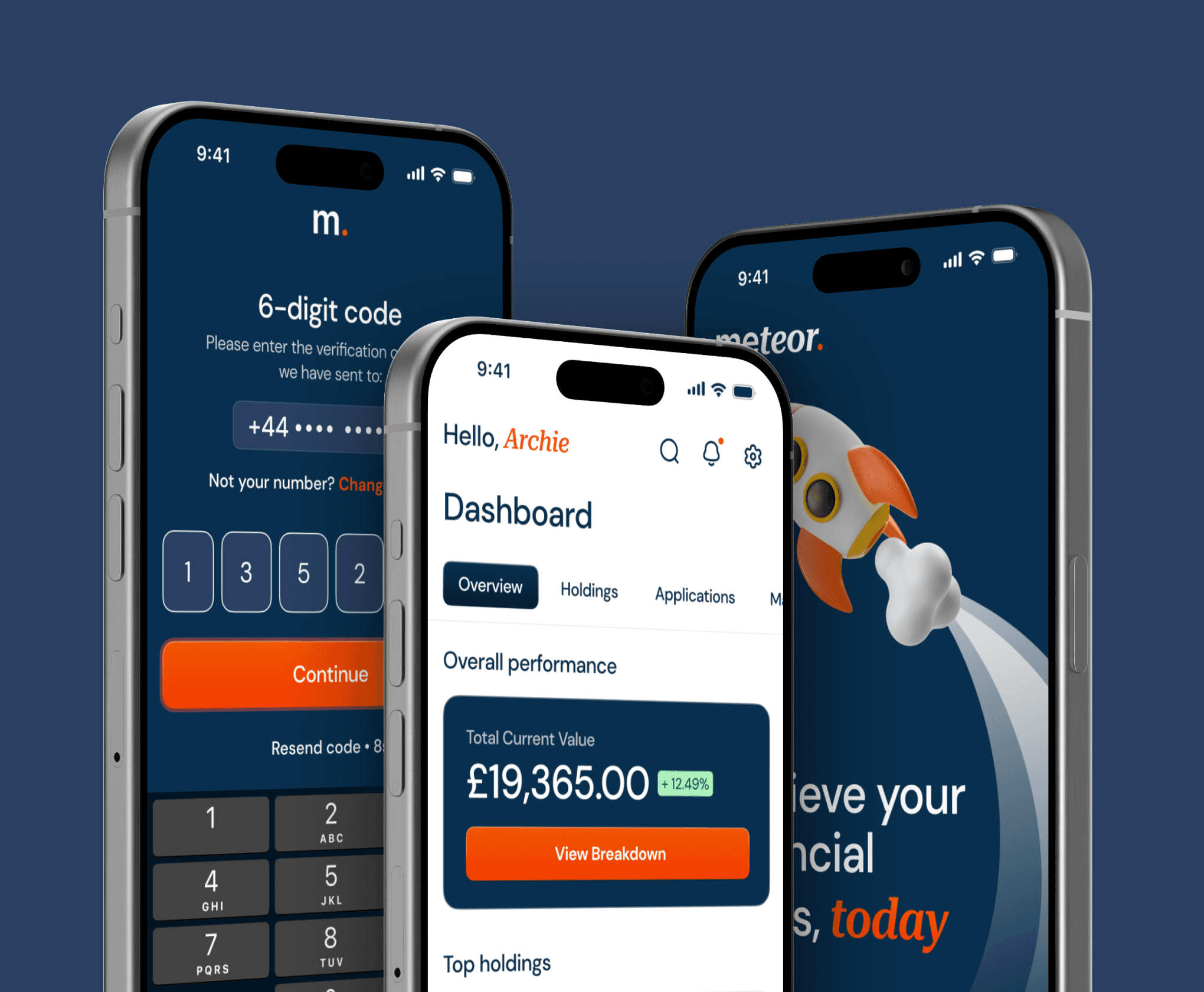
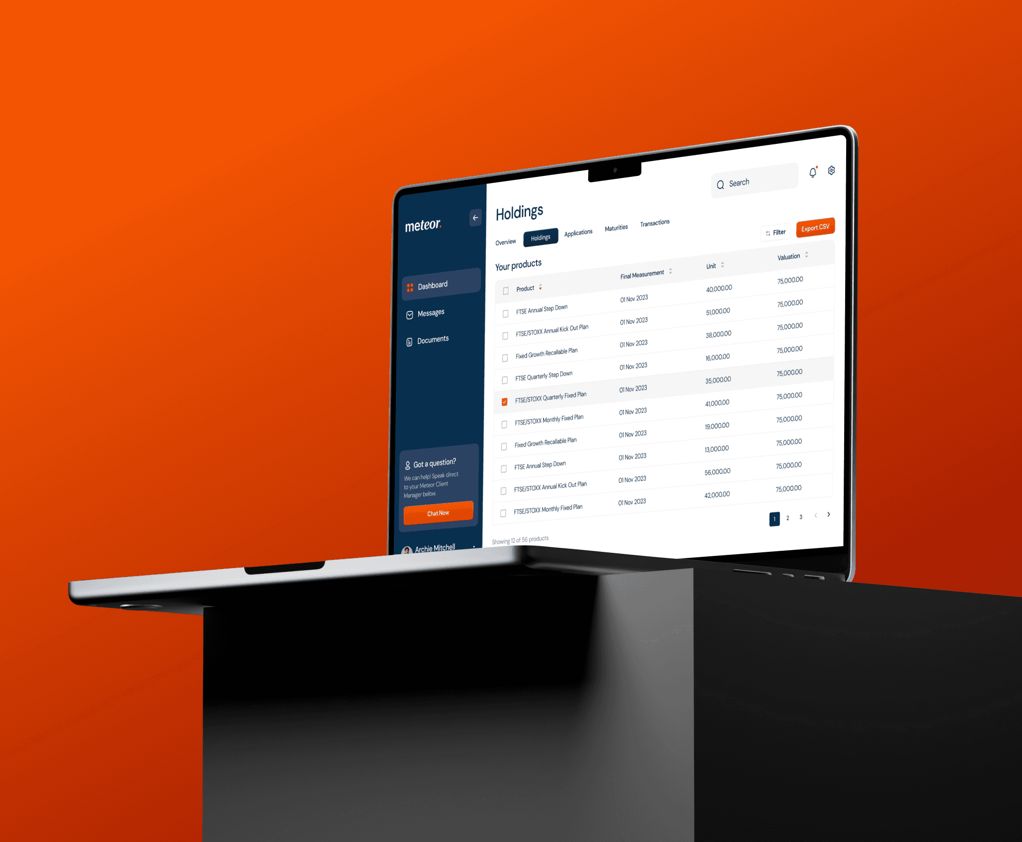
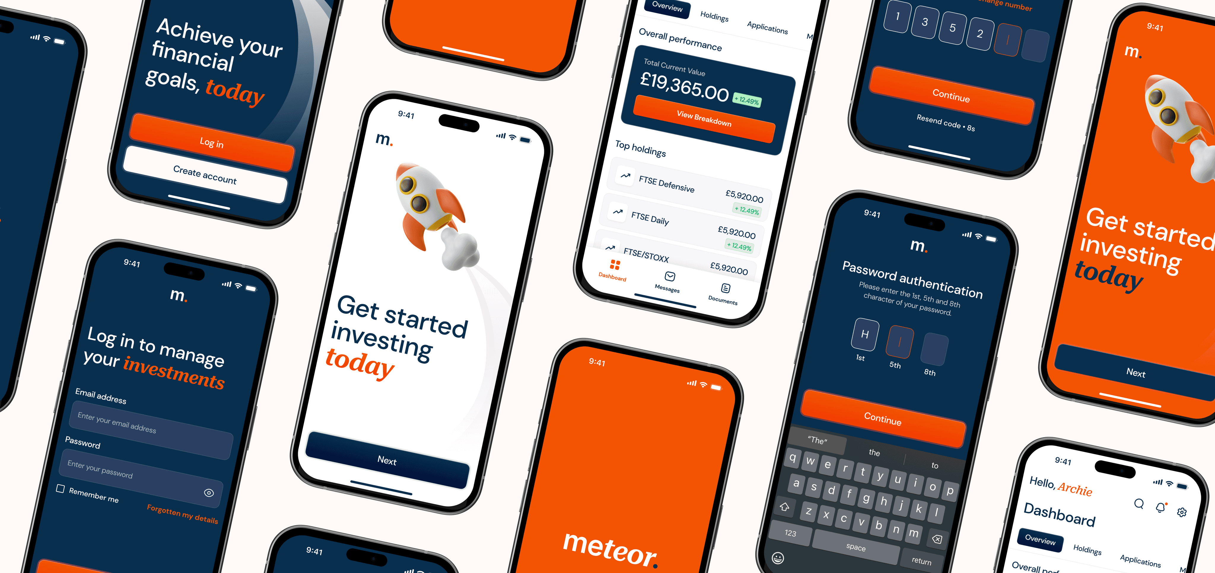
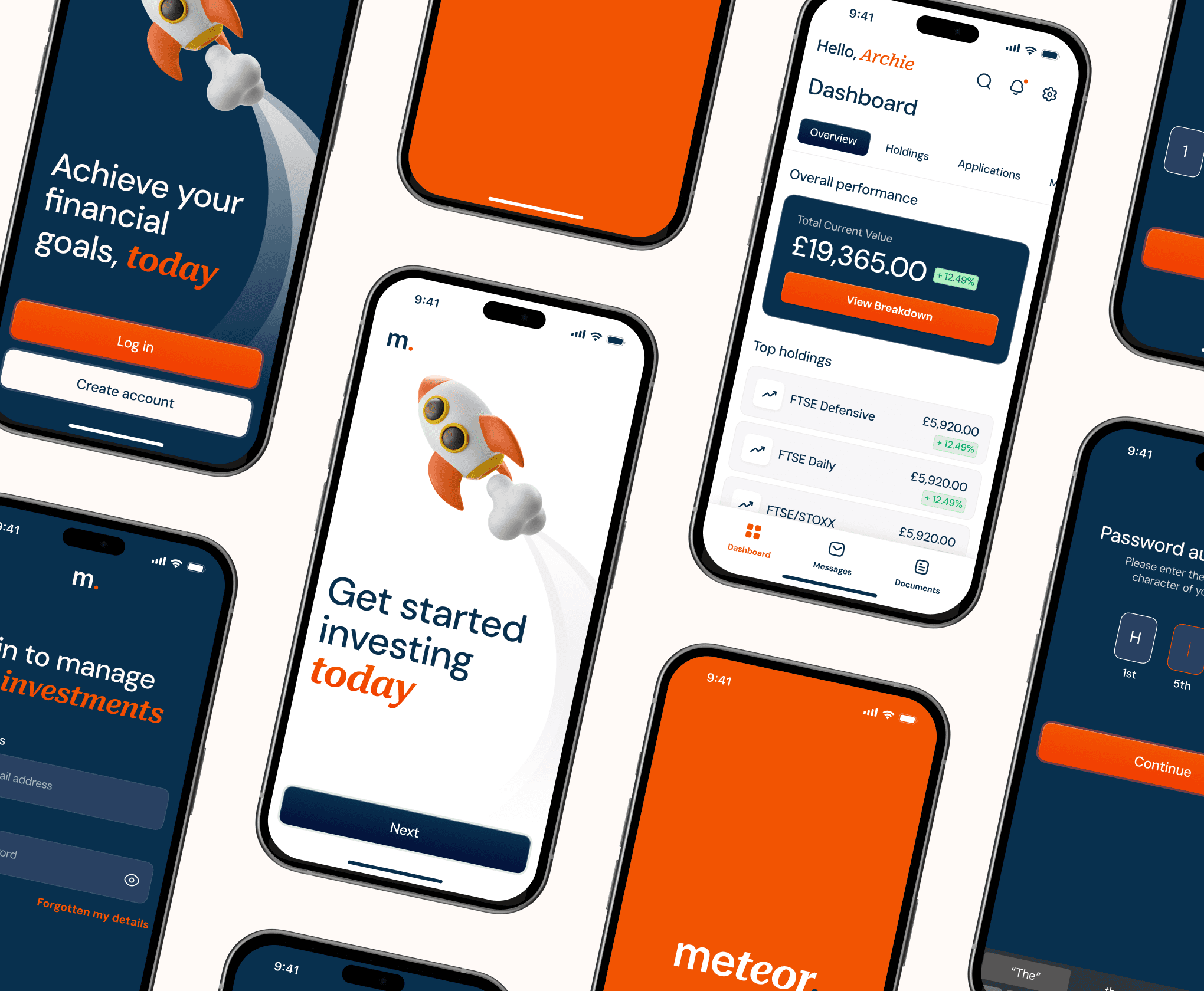
My goal as I led the design process for this project was to modernise the look and feel of a selection of screens from their current platform on both web and mobile, whilst ensuring it stayed aligned to their current brand’s identity.
I introduced sleek, contemporary fonts, refined spacing, and stronger information hierarchy which in turn helped make the platform clearer, easier to use, and visually engaging.


FEEDBACK
After our bid to win the project was successful, the Client Partner that was running the presales project fed back to me that “the concept work you did was the main driving factor for why we won it.” I believe that producing high-fidelity visuals, and sometimes motion, are a great way to pull stakeholders in as they see their product come to life.
After our bid to win the project was successful, the Client Partner that was running the presales project fed back to me that “the concept work you did was the main driving factor for why we won it.” I believe that producing high-fidelity visuals, and sometimes motion, are a great way to pull stakeholders in as they see their product come to life.

More Works More Works
More Works More Works
UI Design
UI Design
Honk
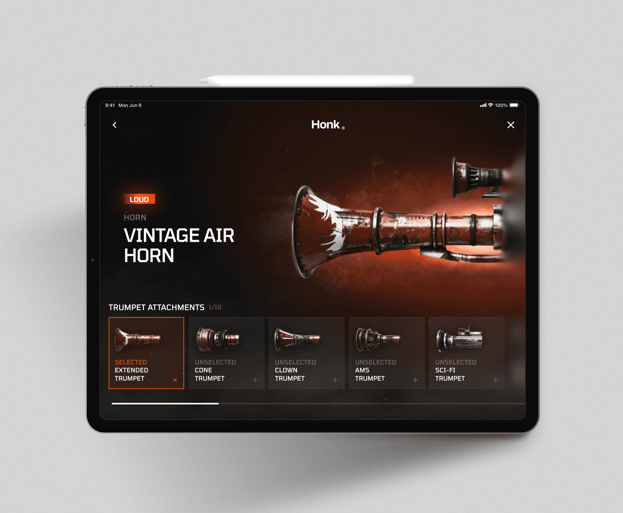
UI Design
UI Design
Honk

UI Design
UI Design
Honk

UI Design
UI Design
Honk

UI Design
UI Design
Honk

UI Design
UI Design
Motion
Motion
Digital Health

UI Design
UI Design
Motion
Motion
Digital Health

UI Design
UI Design
Motion
Motion
Digital Health

UI Design
UI Design
Motion
Motion
Digital Health

UI Design
UI Design
Motion
Motion
Digital Health

STEVENSON
STEVENSON
STEVENSON
STEVENSON
STEVENSON
©2024
GO BACK TO TOP
©2024
GO BACK TO TOP
©2024
GO BACK TO TOP
©2024
GO BACK TO TOP
©2024
GO BACK TO TOP